I have often thought to myself, though never out loud, that the moon has to be my favourite lighting feature; accessible to all, startling at times, often unnoticed, but ever present. And colourful too!
Obviously it is not the light source itself, but a reflector and its’ apparent colours are affected by the atmospheric conditions between us and it. It is a distant surface on which our eyes fix, that speaks of our relative place in the cosmos. Consequently the moon often carries an emotional connotation, sometimes romantic, at others existential (I am thinking of Paul Simon’s “Song about the moon” or Britten’s Moonlight “Sea Interlude” among many musical examples). As a young artist I was very involved with colourfield painters like Rothko, so I guess some aspects of my work draw on that background, exploring large fields of colour juxtaposed together. These were early immersive-style Artworks that appealed directly to the senses and emotions. I first became involved directly in the programming of LED lighting through its’ ability to create movement in a static object or through a space, which pushes this quality a little further still.
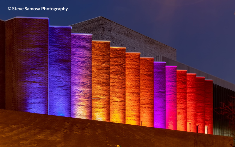
The lighting for Shakespeare North Playhouse for a long time only existed as a preliminary visual concept which happened to include the moon (as is my wont), and it was only as the moment to programme the lighting shows approached that the two elements finally combined. I was very keen to avoid the primary rainbow colour palette that has become a common visual trope. Colour choice has often been an intuitive activity, without a structure. However, having seen the photographs taken at varying stages of the moon’s phases and under different atmospheric conditions I realised some time later that this could provide the basic palette for the lighting colours, connecting with the references to the moon that occur in Shakespeare. These colours are a curious blend of warm and cool, there’s fire and ice, almost a full seasonal feel. It is also rather timeless as a palette, engaging but not unduly bold. Using these colours to animate the folded facade of the building provides a very strong visual focus and drama to the building, without being overbearing. Some of the shows mimic the candle flames of the performance, others the opening of the curtains. There is an emotional sense of excitement in the build up to the performance time, and a relaxation after the event.
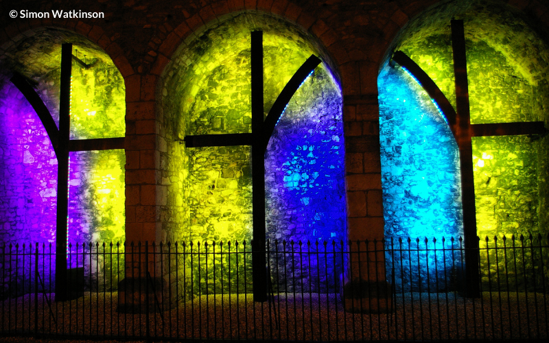
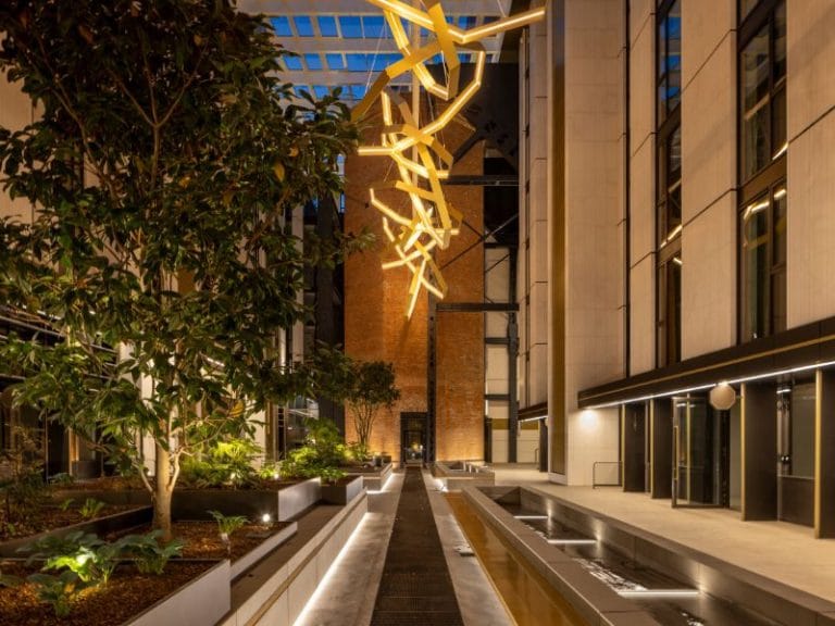
This work builds on earlier projects such as Halation for the High Arcades in Southampton, which introduced a stained glass quality into these scheduled ancient monuments, whilst Once in a Lifetime in Lankasters Vault played with the subterranean qualities of the space and the flow of water. Having trained originally as a sculptor, colour and light crept into my work over a period of time to such an extent that when I look at my portfolio now I realise it has become a dominant feature.


